Shaz Memon, the Marketing Expert, shares what makes a good logo and the crucial role logos play in brand identity.
You could say my career started by creating logos that ‘pop’. Growing up in a family of designers, as the youngest I was exposed to design tools from the young age of eight.
When my brothers would leave the house, I would enter the prohibited arena and play with their design tools and try and imitate them as my role models. I would even try to do one-up on them and create logos that were louder and cleverer than theirs.
When I grew old enough to start a business from design (age 16), I won all my clients through this same approach. In fact, some clients would describe me as the most creative designer they had ever met.
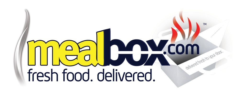
Here is an example of a logo I made approximately 13 years ago that many would say (especially the client) is a logo that ‘pops’.
The truth is they didn’t know any better and this is a wonderful example of a dated logo!
The problem with identities that try really hard to be different through eye candy is that they aren’t able to stand the test of time.
They aren’t easily transferrable to different sizes due to legibility, they don’t print well on all substrates, and when benchmarked against the leading brands we all love and transact with… it just looks like that glaringly cheap, poor cut outfit at an exclusive dinner party (God, I realise I sound like a right toff saying this – I wish I had better examples!).
In my talks, I ask people to raise their hands if when they look back at their pictures from more than 10 years ago, they think, ‘What was I smoking?’. Nearly the entire room raises their hand.
The point I make is that what we love today will change very quickly. Approving a dental brand identity purely based on your own preferences, and without professional support, could mean that you come to hate your identity years on and have to start again much sooner than you would have liked…
This can be a difficult process as patients have come to recognise the brand identity you once loved! Further down this article, I share how I overcame this dilemma for my own brand (and you can too) that I designed in maths class age 16.


This is my friend Milad, aka the Singing Dentist. I asked him the same question: ‘Do you look back at your pictures and think, why was I wearing that?’. He answered: ‘To be fair, bruv, this drip still looks pretty sick still.’
Not the response I was expecting… but you get the point I am trying to make.
Brand identities
Brand identities (often confused with Logos) evoke a feeling.
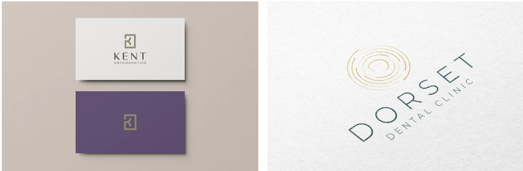
Look at these logos:
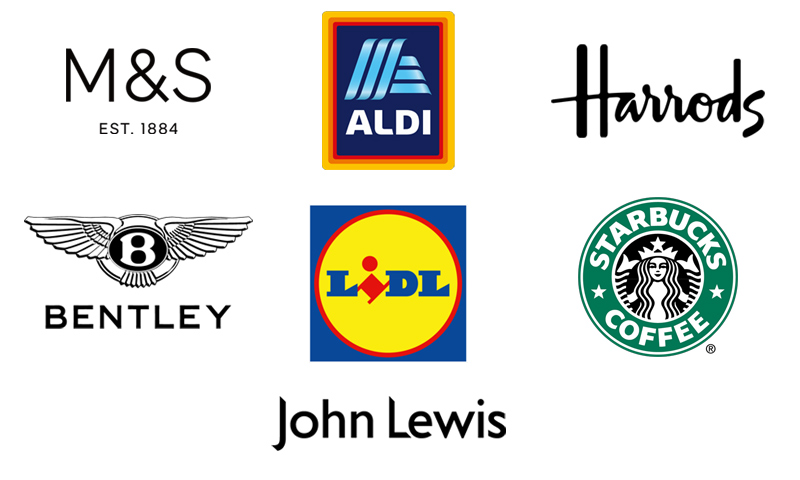
Each logo above makes us feel something about the brand, through its shapes, typography and colours.
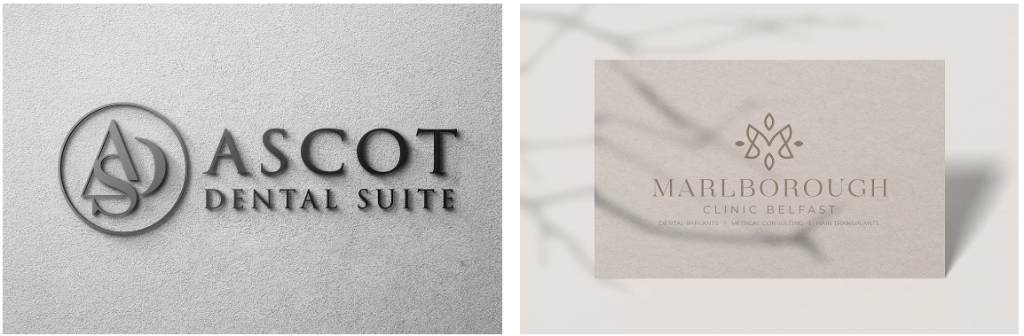
Now let’s look at these again. Do you feel the same way about the brands’ quality, friendliness or reliability that you did with the above logos?
Our perception of the above brand identities changes completely with a simple change in styling.
Did you know…
- BP paid $211 million for a logo
- Accenture paid $100 million for its rebranding
- Posten Norge, a Norwegian postal service, spent $55 million on their new logo
- Wolff Olins charged $625,000 for the infamously bad 2012 Olympic Games logo
- Tropicana lost an estimated $137 million when its rebranding led to a 20% drop in sales.
I am definitely not suggesting that spending more money equates to better results. Absolutely not.
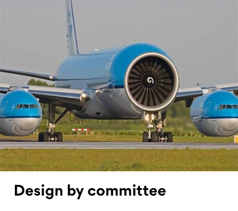
In reality, the designer likely received less than 10% of the total expenditure. Most of the money spent on these large rebrands goes towards consultancy, analysis and revisions, along with losses often caused by design by committee.
Big brands understand the financial impact of branding and identity. They know that defining their vision for the brand they wish to become, who they want to attract and their roadmap is key to phenomenal execution.
Brand identities can grow, damage or alienate customers (or patients).
I could have designed this myself in ‘Word‘
Before Digimax became dental-only, I once received a design brief from an incredibly talented lady who created custom-made handbags. She stated her bags were far superior to designer brands, and I believe her.
Her design brief was fixated on fitting in as a luxury bag designer while also standing out – which made sense.
When I presented a logo that I felt met this criterion, I heard the sentence that any designer dreads: ‘I could have designed this myself in Microsoft Word.’
The logo presented was entirely custom, featuring a custom typeface, simple, chic and incredibly timeless – yet it was so basic that I could understand why a layperson would make such a comment.
I could see how this brand identity was outstanding by visualising its infinite applications, but the client couldn’t. I guess a client needs to really understand branding to some extent and believe in its importance to get the most out of the process.
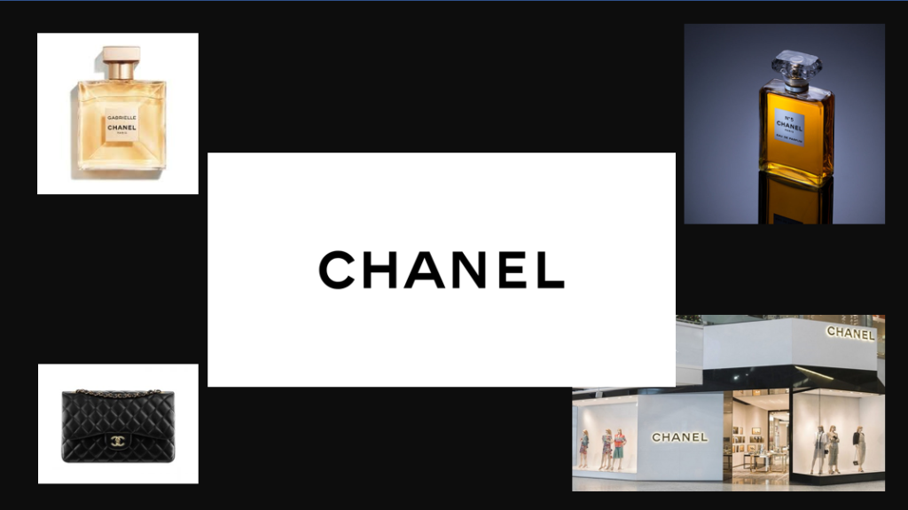
Would we say the same about a brand like Chanel?
This is the Chanel logo (that some may think could have been designed in ‘Word’).

See how amazing it actually looks in different substrates and settings…
Why do large companies opt for simple logos?
Large companies often opt for simple logos despite their substantial budgets for branding. The reason behind this choice lies in the power of simplicity and recognisability.
Simple logos are easier to remember and recognise. They become synonymous with the brand, making it instantly identifiable even without the company name.
Think of the golden arches of McDonald’s or the swoosh of Nike. These logos are so simple that they’ve become iconic.
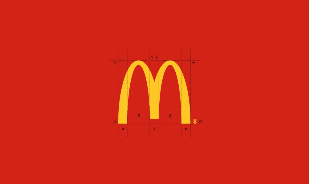
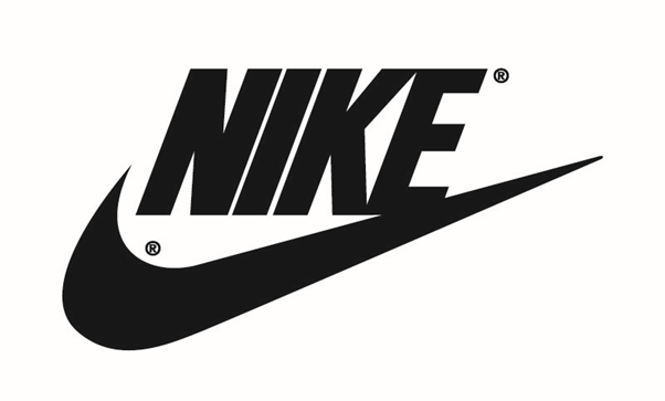
Moreover, simple logos are versatile. They work well across various mediums, from billboards to smartphone screens, ensuring consistent branding.
Complex logos can lose their impact when scaled down or simplified, leading to inconsistency in brand representation.
Additionally, simple logos are less likely to become outdated. They are not tied to specific trends or design elements, making them enduring symbols of the brand.
This longevity minimises the need for frequent logo changes, reducing associated costs and potential customer confusion.
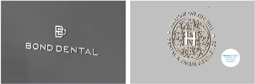
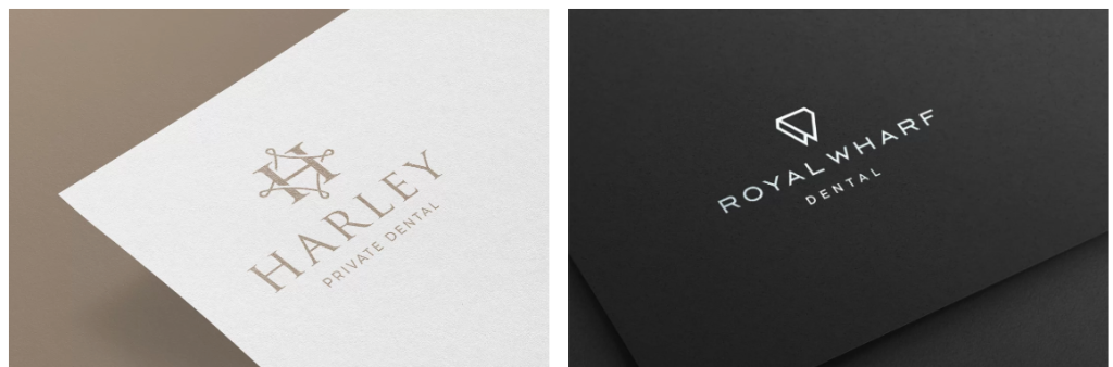
Dental logos by Digimax
Dental logos don’t need to be teeth!
Digimax OneBrand
Make it yours.
Are you looking to open a squat practice but are confused about brand names? Want a short domain name to support your brand?
Welcome to OneBrand. A first of its kind in dentistry, offering done-for-you, unique identities ready to plug and play.
We have a library of professionally developed identities for sale that come with a valuable short domain name.
Here is an example…
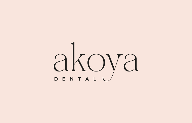
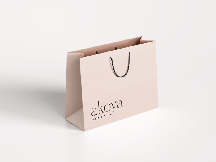
Includes akoya.co.uk
For sale
Akoya Dental: A story of natural radiance and wellbeing
At Akoya Dental, our name is inspired by the Akoya pearl, renowned for its natural beauty, purity and strength. Just as the Akoya pearl is formed through a process of natural regeneration and transformation within its oyster, we believe in the transformative power of holistic dental care to enhance overall health and wellbeing.
Our journey began with a vision to create a dental practice that goes beyond conventional treatments, embracing a philosophy centred on nature, health, and regeneration. We understand that true dental care is not just about treating teeth, but about nurturing the whole person. This belief drives us to integrate the latest dental advancements with a deep commitment to patient care and comfort.
At Akoya Dental, our approach is rooted in the principles of natural healing and regeneration. We use biocompatible materials and minimally invasive techniques to ensure that every treatment supports the body’s natural ability to heal and rejuvenate. Our serene, nature-inspired clinic environment is designed to promote relaxation and reduce anxiety, creating a space where patients can feel at ease and cared for.
Health is at the heart of everything we do. We believe that a healthy smile contributes significantly to overall wellbeing and happiness. Our team of experienced professionals is dedicated to providing personalised care tailored to each patient’s unique needs. We take the time to listen, understand, and create treatment plans that foster long-term health and vibrant smiles.
Akoya Dental is more than a dental practice; it is a sanctuary for those seeking holistic dental care that honours the natural connection between oral health and overall wellbeing. Join us on a journey to radiant smiles and renewed health, where every visit is a step towards a happier, healthier you.
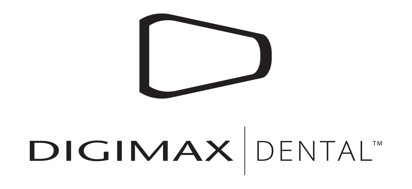
Digimax logo age 16
I remember designing the ‘D’ you see below in maths class. While it was tempting to make it 3D, add special effects and use colour gradients, keeping it simple has allowed me to retain an identity that has been iconic and memorable for over 20 years.

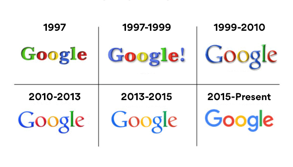
How have established brands evolved their logo over time?
Large companies understand the importance of evolving with the times while maintaining their brand’s essence. When they decide to update their logos, it’s a carefully considered process.
For example, Google’s logo evolution over the years showcases subtle yet impactful changes. They prioritise retaining brand recognition while modernising their image to stay relevant in the digital age.
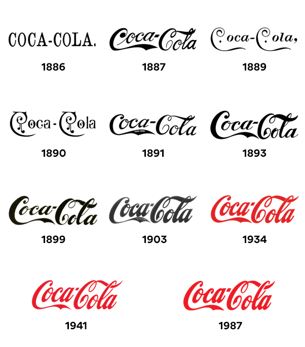
How do you avoid disengaging your audience when you change your practice name?
The challenge for large companies during logo changes is to avoid disengaging their loyal customers.
They achieve this by transparently communicating the reasons behind the change and emphasising their commitment to delivering value. Coca-Cola successfully navigated this when they updated their logo, assuring customers that their core product remained unchanged.
Related article: How to change your dental practice name, without losing patients.
If you have an established dental brand identity and feel it could do with a refresh without changing it so much that it’s not recognisable, at Digimax, we have our Refresh package.
Why is it important to design a dental logo by identifying the kind of practice you wish to become?
A common mistake novice entrepreneurs make is thinking that the ultra-wealthy love the look of gold, marble and silver.
Sure, these are beautiful colours and textures, but that alone won’t be the reason you attract most of your clientele.
You may have experienced this: most patients who can spend significantly on their dental treatment wouldn’t stand out as different from a crowd based on their appearance. Many of the financially comfortable wouldn’t describe themselves as rich, nor would they want to select a practice that is oozing with gold leaf.
They tend to prioritise and value exceptional care, communication and a brand story over overt luxury.
Related article: Everything you need to know about using gold or silver in your dental logo.
This is where brands like John Lewis, Marks and Spencer, and even Harvey Nichols have absolutely nailed it. None of these brands feel intimidating enough for the general population, but if you are affluent you can fit in perfectly and feel welcome!
My advice for private practices, offering high quality dentistry is to appear high end through simplicity and a timeless design.
Dress for the job you want, not the job you have
When creating your dental brand identity, be open with your designer about the practice you wish to become. Discuss the treatment split, and ideally, outline your five to 10 year plan.
Absolutely share details about the kind of practice you are and who you attract, as this will be important for your designer to keep your brand relatable to the patients you currently attract.
By planning for the future, you can design the perfect identity that meets both current and future objectives.
Timeless dental logos are powerful
Timeless logos, like Apple’s iconic logo, hold immense power. They remain relevant through changing times, fostering trust and loyalty.
Patients come to associate your logo with quality and reliability, making it a cornerstone of your brand’s success.
The enduring nature of a timeless logo minimises the need for costly rebranding efforts and ensures a consistent brand image.
Starbucks logo evolution
Starbucks, a renowned global brand, has undergone a notable logo evolution.
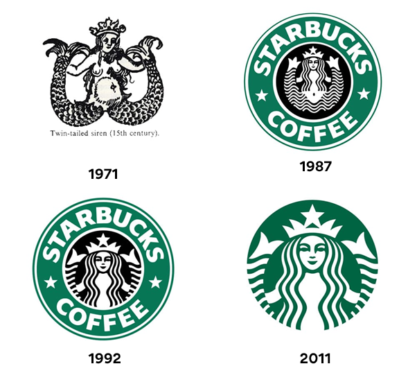
Their journey from a detailed, brown siren to a simplified, green version represents a shift towards modernity and sustainability.
The Starbucks logo evolution mirrors their commitment to coffee excellence and environmental consciousness, demonstrating how large companies adapt their logos to reflect evolving values.
Hidden logo meanings
Some logos hold hidden meanings that add depth to their design. A striking example is the FedEx logo. The arrow hidden in the negative space between the ‘e’ and ‘x’ symbolises speed and precision, aligning perfectly with the company’s core values of efficient and reliable delivery services.
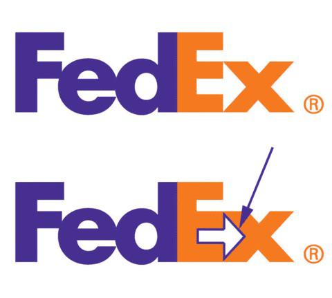
Such hidden elements can create an extra layer of connection and intrigue for customers, making the logo more memorable and meaningful.
The hidden meaning should not be forced; instead, it should be singular and thoughtfully integrated.
I point towards logos with hidden meanings, emphasising that there is one subtle meaning present, which adds to the design without overwhelming it.
If you are interested in a brand identity design for your practice or personal brand, at Digimax we have packages starting from £500.
Get in touch and learn more here: https://digimax.dental/branding/

