 Shaz Memon describes what makes the perfect dental website.
 What is it about Amazon that makes the whole online shopping experience so appealing?
Aside from its seamless purchasing and returns services, Amazon communicates to us our ‘purchase beacons’ within moments of searching its site, personalising the complete consumer journey.
This is a term I coined to help my design team and our clients understand an important, yet very simple, concept behind the psychology of great user-interface design.
In essence, a ‘purchase beacon’ is made up of one or more pieces of information we will view that will push us over the line to making a purchase or enquiry.

What are we looking for?
Of course, we are all wired differently. We all place different values on what it is that matters to our purchasing decisions. Indeed, this is evident in any given patient base and the wide range of questions that emerge.

One dentist told me he had a patient come through for implant treatment at his London practice based solely on the fact he was from Glasgow. As was the patient’s mother.
![]()
But, ultimately, every visitor to a website wants two things. They want a very fast ‘journey’ through an aesthetically appealing interface.
It is commonly agreed that the average time any of us spend on a homepage before we make the ‘stay or leave’ decision is three seconds. When a visitor leaves your dental website quickly after arrival, this is the ‘bounce rate’.
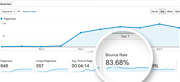
Dental website bounce rate
After much research, we discovered the average dental website (including many new ones) has an alarming 70% bounce rate. This means the dental website you thought was great – as I assume you signed it off with your dental website designer – is most likely failing you. This is because, quite simply, seven out of 10 visitors are leaving it almost immediately upon arrival.
The reason they are leaving is this – as the digital world speeds up, led by easy-to-assimilate and fast feeds on apps such as Instagram and Facebook, we no longer expect to have to work for our information.

The knock-on effect means consumers are withholding their ‘click’ or ‘scroll’ currency when a dental website is not a seamless experience. Visitors lose patience. They either give up on their search or look elsewhere, putting on ice the initial idea of a transaction.

Purchasing pages
So, when it comes to Amazon, what is it that nails the all-essential purchasing decision? Here is a list of seven influencing factors:
- How fast we will get the item
![]()
![]()

- How many reviews the item has
![]()
- What the reviews say about the item

- The price of the item

- The detail in the picture(s)

- The description of the item
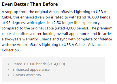
- How fast we can check out.

If any of the above seven points required more than a minimal click or scroll, revenue for Amazon would drop.
These purchasing pages don’t just happen. Teams of designers, user-experience specialists and psychologists are involved in the production and continuous improvement of ‘money pages’ on such websites.

Dental website ‘money pages’
Some of the key ‘money pages’ for a dental practice are the homepage, team, treatment, gallery, fees and contact us page. Consequently there are elements that should be on all these pages to make them convert patients into enquiries.
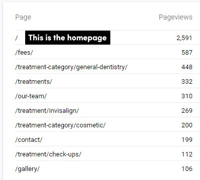
In effect, a beautifully designed dental website and a great marketing strategy will fail to deliver new patients if these necessary ‘purchase beacons’ are missing. Or if the site fails to instantly communicate the information sought and with minimal effort from the interested patients.
Almost every dentist has a very high – what I like to call – ‘personal conversion rate’. We can all agree that once a patient is sitting in the chair, it’s highly unlikely they fail to proceed with treatment. Unless, of course, there is a medical or affordability issue.
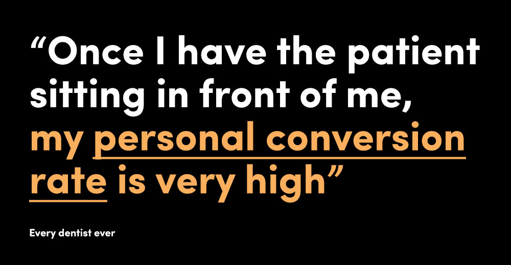
Very few of us will go to the great effort of booking an appointment and taking time out of our busy schedule if we haven’t a strong intention to transact. This consequently taught us at Digimax that every dental website we create needs to swiftly lead each patient through to making contact with the practice. That’s without having to find their way around unnecessary ‘obstacles’.
Key problems
- The physical address is not visible on a mobile device unless you click. From our own research, we discovered that patients want to see this information straight away
- The phone number is not visible on a mobile device unless you click somewhere, such as the ‘contact us’ page
- Treatments are called ‘services’. Unless you are a mechanic, I find this to be an inappropriate classification for high value treatments
- The only way to see the treatments is hovering or clicking on a menu called ‘Treatments’ – an unnecessary click/action
- On the homepage, it is hard to tell where a practice’s treatment strengths lie. Is the principal a master educator, does the practice have incredible premises or the team is multi-lingual?
- To quickly see the core treatments the practice offers requires a lot of scrolling
- Important treatments such as Invisalign and dental implants are deeply hidden in menus. How you prioritise them in menus is often how a patient may feel you prioritise these treatments in the practice
- Websites assume a patient is going to click on dental implants. Why would they know what an implant does?
- Websites assume a patient is going to click on Invisalign. Why would they know what Invisalign is?
- Mobile websites require a lot of unnecessary scrolling to find key information
- The contact page requires scrolling to get to important information
- Dental website enquiry forms ask more questions than is necessary
- Google reviews are not easily visible on the site, if visible at all
- Missing treatment animation videos – if someone clicks a video they are more likely to complete the contact form
- The key treatment categories are hidden deep in the site
- An assumption that patients will know what orthodontics means
- Opening the homepage with a ‘one size fits all’ image – assuming it will appeal to all demographics with whom you wish to engage
- Peppering the site with your email address – there is less chance of a form enquiry disappearing than an email not arriving due to complex spam filters
- Having to hunt for ‘before and after’ cases
- No real insight into the principal and the team.
To reduce dental website bounce rates from 70% down to almost 30%-50% in most cases, the team at Digimax uses the knowledge it has accrued since 2003 to lead clients through the dental website design process. Particularly important is the data we collect over the years. We have therefore seen a huge shift in the way patients interact with websites.
The lower the bounce rate, the more a patient stays on the site. The more a patient stays, the greater chance they will contact you. A contact can lead to a patient. A patient can lead to a lifetime benefit for the practice as they will refer their family and friends if they are happy. Imagine missing out on all of this and losing money you invested in marketing. Only for that potential patient to bounce off the site.
Key solutions
- We have designed a ‘Treatment Finder’ that leads patients to a treatment page based on their ‘problem’
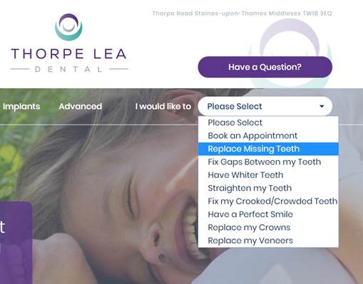
- We avoid clicks into deep categories and sub-categories. Instead, we display the core treatment categories in the main header

- We use ‘Social Proof’ by showing live Google Reviews

- Our eyes naturally look towards the top right of pages. We ensure the key call to action data is always clearly visible in the top right

- We ensure the main header communicates many of the key ‘purchase beacons’ we feel are important for patients at that practice.

The client cited above told us that just by changing the dental website they began to receive more enquiries. This made sense as this is what a dental website by Digimax or an experienced designer should do. It should efficiently convert the people who are already landing on your dental website.
The above are just five points, but we have almost 120 points in our ‘success formula’. We apply this formula to our websites to ensure every pixel has a purpose. Ultimately, these sites are designed for patients. This applies to you even if you are already a busy practice or are looking to get more patients.
Dental website design guide
Frustrated at constantly seeing practices losing out on conversions from their websites, I wrote A five-step dental website design guide (that anyone can follow). In this article I have developed on the content in a bid to help practice owners identify the flaws within their own websites.
Before Digimax Dental, we were working on design and branding for some incredibly famous and respected brands. You can see our non-dental work at www.digimax.co.uk and clicking on ‘big brands’. We have been working with non-dental businesses since 2003. From fashion to property through to high level e-commerce and you will know many of the names. From this experience, we therefore took all the best things we learnt from non-dental business websites and applied it to our dental practice clients. Many practice owners tell us this is why they chose Digimax. Because we have a wider experience beyond dentistry. And, thanks to this, we have learnt what does, as well as what doesn’t, work and we apply the positives to our ‘success formula’.
In essence, these are the key elements we place in the header and the homepage to ensure the maximum number of patients engage and want to browse with the minimal number of clicks required to find what they are looking for.
Digimax
All our new websites perform exceptionally well for conversion since their launch. We believe so passionately in our ‘success formula’ that we only offer our SEO services to clients with a Digimax site. We know this is the only way of fairly maximising the opportunity for success for the practice.
Whilst our dental website headers are a lot busier than most – believe me, as a designer, I’d love to create ‘uber light’ fashionista sites with a lot of white space and striking images – the evidence suggests that our ‘success formula’ works. And I know only too well how important evidence-based practices are to dentists. I am not willing to compromise function and return over a simpler, lighter design just to get a fast approval from a client.
To see how we have applied our ‘success formula’ to some amazing practices, visit: digimax.dental/dental-marketing-portfolio.
I hope from this article you will start thinking differently about your dental website and understand that having a website is far more than a box ticking exercise. A poor website loses you money, sums that you couldn’t even imagine. Website visitors are not going to tell you why they left your site or didn’t complete the contact form.

